The first thing most buyers touch is your front door. Before they notice the new boiler or the double glazing, they are standing on the step, clocking the colour, the handle, the feel of the key in the lock. By the time you have shown them the kitchen, a quiet verdict has already formed.
Estate agents across the UK will tell you the same story in different words: tidy front doors in certain colours tend to bring faster offers, and wild choices often slow a sale down. Not because buyers are petty, but because the entrance sets a script in their minds about how well the rest of the home has been looked after.
You do not need to redesign the façade or rebuild the porch. A tin of paint and an afternoon can be enough to shift your home from “might view again” to “we could live here”. The trick is choosing a colour that flatters the property and calms the buyer, rather than one that just suits your favourite coat.
A front door colour does not sell a house on its own, but it quietly nudges buyers towards “yes” or “no” long before the offer stage.
Why your front door is doing quiet psychology
Buyers make a rough judgement of a property within seconds of arriving. The front door sits at the centre of that first frame. Its colour, condition and style feed into instant assumptions: is this place cared for, is it modern or dated, is it likely to hide problems?
Online, the effect starts even earlier. On portals, the main exterior photo is often shrunk to a small thumbnail. Amid rows of brick and render, the door is one of the few areas of strong colour that still reads at that size. A calm, well-chosen shade can make your listing feel quietly “put together” instead of noisy or anonymous.
Colour psychology plays a part, but not in a horoscope way. Deep blues and charcoals are read as steady and smart. Soft greens suggest calm and “good taste”. Chalky whites feel clean but can also look flat if the rest of the façade is very pale. The brain ties those cues to expectations about maintenance and lifestyle.
What estate agents actually see on viewings
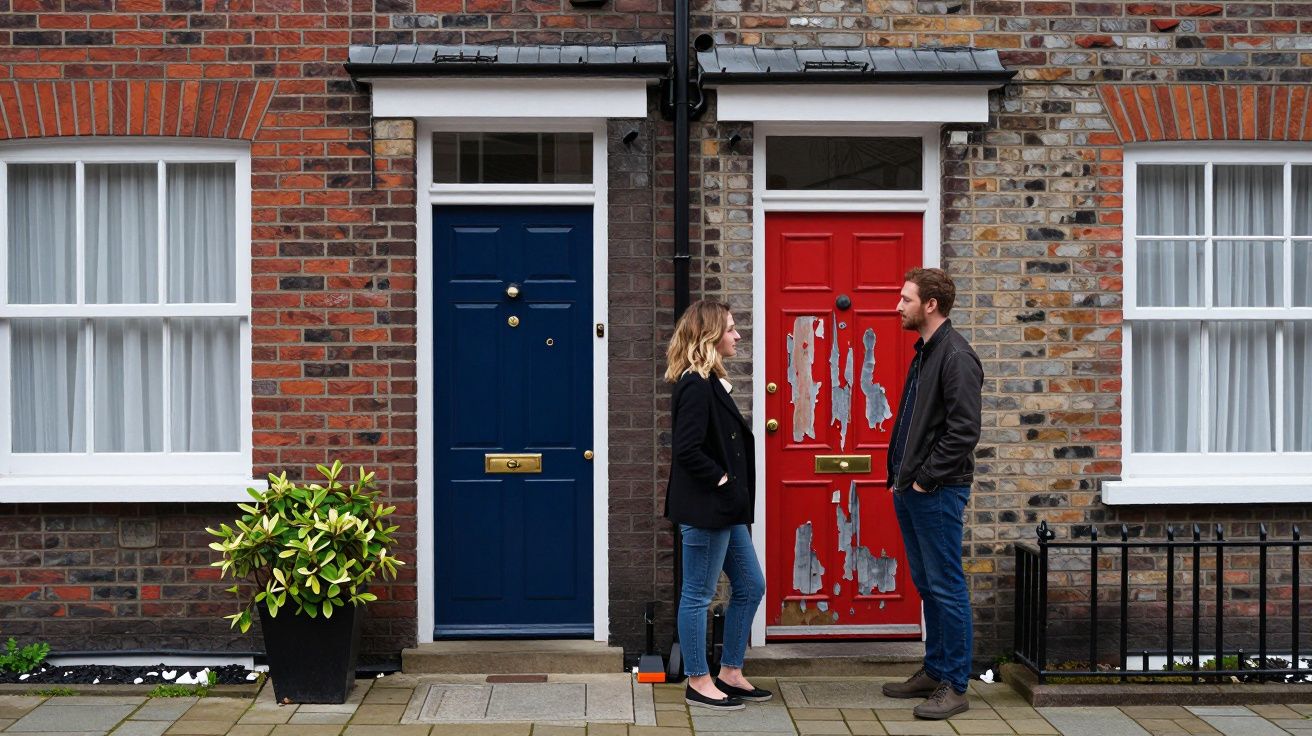
Ask an experienced agent about Saturday viewings and they will talk less about paint charts and more about reactions. A couple arrive outside two near-identical semis: same street, similar price, similar layout inside. One has a peeling, faded red door; the other, a freshly painted deep blue with simple brass hardware. Most viewers assume the blue door house is “nicer” before they have stepped in.
In feedback calls, buyers rarely say “The yellow door put us off”. They say things like “It felt a bit much” or “We could not picture ourselves there”. When an entrance colour jars, it makes the home feel more like someone else’s strong personality than a place they can make their own. Neutral-but-interesting shades do the opposite: they give just enough character without closing the imagination down.
Agents who work the same patch for years notice patterns in their completion spreadsheets. Streets and flats where doors are broadly in the same calm palette tend to cycle through owners more smoothly. The dramatic one-offs do sell - but usually to a narrower audience and often after more viewings.
The colours that tend to sell fastest
Talk to agents from Glasgow to Guildford and a loose consensus emerges. Certain families of colours keep cropping up on homes that go under offer quickly, especially in mainstream price ranges where buyers are risk‑averse.
Here are the shades they mention most often:
- Deep navy and inky blues – Read as smart, solid and a little upmarket. Work well on period terraces and bay‑fronted semis.
- Charcoal, graphite and near‑black – Feel contemporary and crisp without the harshness of pure black. Suit new‑builds and 1930s houses.
- Soft sage and muted greens – Suggest calm, nature and “tasteful” décor inside. Especially good with stone or cream render.
- Classic off‑white, putty and stone – Clean and versatile, particularly when the surrounding brick is strong in colour.
- Muted teal and blue‑green – Add personality while still feeling grown‑up, popular in coastal towns and creative urban pockets.
A neat way to think about it:
| Shade family | Signal it sends buyers | Often best for |
|---|---|---|
| Deep blue / charcoal | Orderly, well‑kept, “good bones” | Family homes, city terraces |
| Soft green / blue‑green | Calm, gentle character | Cottages, village homes, garden‑focused houses |
| Off‑white / putty | Light, clean, low risk | Flats, townhouses with strong brick or stone |
Buyers rarely fall out of love with a door that looks calm and cared for. They do fall out of love with colours that feel like a costume.
None of this means you must banish colour completely. It is less about how bold the shade appears on a paint card and more about how softened and greyed‑out it looks in daylight. Harsher, highly saturated colours tend to shout. Slightly muted tones feel more expensive and easier to live with.
When bold backfires: colours that quietly cost you offers
There is a real difference between a rich, heritage yellow and a fluorescent lemon; between a deep aubergine and a glossy purple. In person, though, subtlety is often lost. Buyers just see “bright” or “loud”, especially in drizzle and estate‑agent‑appointment rush.
Strong front door colours can work brilliantly for the right buyer in the right neighbourhood - creative city enclaves, mews streets, coastal rows where every cottage is different. The issue is not taste; it is reach. The bolder the shade, the smaller the pool of people willing to accept it or repaint immediately.
Signs your current colour may be slowing things down:
- It looks very different dry on the door to how it looked on the tester card.
- You can see the door before anything else when you scroll past your own listing online.
- Friends comment on the colour before they comment on the house.
- The paint is bright and chipped or weathered, amplifying the sense of neglect.
If you have already gone live with a loud colour and early feedback is lukewarm, a mid‑campaign repaint can be worth doing. It is cheaper than a price cut and less dramatic than refitting a kitchen, but it can reset first impressions in a way that spreadsheets later struggle to explain.
Matching the door to the house, not the trend
Paint companies launch new front‑door collections every season. Social media floods you with beautifully styled porches that may share little with your actual street. Instead of chasing trends, start from the fixed points you cannot change: your brick or render, your roof and your windows.
A few simple guides:
- Red or orange brick: Cooler colours (navy, charcoal, sage) usually sit better than warm ones. Creamy whites can work but may look washed out in strong sun.
- Pale render or stone: Slightly deeper doors (deep blue, green‑grey, darker neutrals) stop the façade feeling flat.
- Modern glazing and slim frames: Charcoal, black or very dark greens look intentional and sleek.
- Period details and original glass: Heritage blues, racing green, oxblood and deep greys keep the character while still feeling sale‑friendly.
North, south, city, coast
Light and location tweak the rules. In northern cities with softer, overcast light, deeper colours often look rich rather than heavy. On very bright southern or coastal streets, paler, chalkier shades can be more forgiving and less hot to the touch in summer.
Neighbourhood character matters too. In some conservation areas, planning rules or covenants loosely limit what you can do. In tight terraces where every other door is navy or black, a neon pink door will stand out - which can be good for renters finding you, less good for anxious first‑time buyers.
If in doubt, walk your own street and the next two over. Note which houses feel “inviting” at a glance and which do not, then pay attention to the door colours on each. That local snapshot will often tell you more than a national trend piece.
If you are about to list: a simple repaint plan
If your front door is already in a broadly sale‑friendly shade and the paint is sound, a good clean and hardware polish may be enough. If not, a repaint just before photography is one of the quickest curb‑appeal upgrades you can do.
A simple plan:
- Check the material. Solid wood often takes traditional exterior eggshell or gloss; uPVC and composite doors may need specialist primers or paints designed to bond without peeling.
- Choose a finish. Satin or eggshell tends to look softer and more expensive than high‑gloss, and it hides minor imperfections better.
- Prep properly. Wash down, lightly sand shiny or peeling areas, fill obvious cracks and mask glass and hardware. Skipping this step is what leads to drips and early flaking.
- Mind the timing. Repaint at least a couple of days before photography and your first viewings so any smell disperses and you can fix small misses.
- Update small details. A clean doormat, matching letterbox and handle, and clear house numbers make the new colour feel deliberate rather than patched.
Most sellers can refresh a door for under £100 in materials, often far less. Compared with typical reductions after a few slow weeks on the market, it is a relatively low‑risk experiment.
Common mistakes sellers make with front doors
Buyers forgive plenty, but front‑door missteps linger in their memory more than you might expect. The same themes crop up in agents’ feedback over and over.
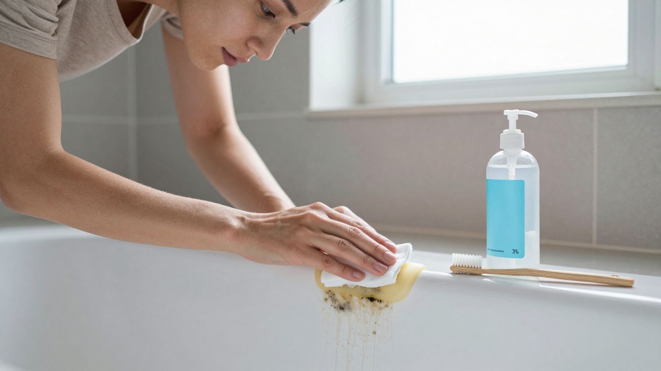
- Peeling paint and rusting hardware. People assume, rightly or wrongly, that what they can see outside hints at what they cannot see inside (loft insulation, electrics, plumbing).
- Seasonal clutter in listing photos. Oversized wreaths, Halloween props and stacks of parcels distract buyers online and date the images fast.
- Too many styles fighting. A hyper‑modern chrome handle, faux‑Victorian knocker and cottage‑style lantern around one door confuse the eye.
- Ignoring the step and surround. Dirty thresholds, weeds in cracks and overfull shoe racks by glazed doors undo much of the effort of a good colour.
None of these require large budgets to fix. They do require a short, honest look at your entrance from a stranger’s point of view - ideally the way your agent or your photographer will see it.
FAQ:
- Should I repaint my front door solely to help sell? If the current colour is tired, very bold or clearly at odds with the house, a repaint is usually worthwhile. If it is already in a calm, well‑kept shade, focus your time and money on other areas buyers care about, such as kitchens, bathrooms and storage.
- Does the exact shade really matter, or just the condition? Condition comes first: flaking or dirty paint puts buyers off faster than any colour choice. Once that is addressed, moving towards deep blues, greys or soft greens can subtly widen your home’s appeal.
- What if I love my bright door and do not want to change it? You do not have to. Just be aware that very distinctive colours can reduce the pool of buyers who feel an instant connection. If your market is slow or your home sits unsold for a while, a more neutral repaint is a lever you can pull later.
- Can I paint a uPVC or composite door? Yes, but you need products made for plastic or composite surfaces and meticulous prep to avoid peeling. If you are unsure, ask a decorator or local paint supplier; sometimes replacing tired hardware and cleaning thoroughly achieves enough.
- Does front door colour change the value of my home, or only the speed of sale? Valuation mainly follows size, location and condition. Front door colour tends to influence how many people book viewings and how quickly they feel comfortable making an offer. That can affect how long you sit on the market and how much negotiating power you keep.


Comments (0)
No comments yet. Be the first to comment!
Leave a Comment